Categories
Technical

English Counties and UAs in One

Great Britain’s administrative geography is rather complicated, particularly for England – some English areas are “three tier”, made up of counties which are subdivided into districts, and others are “two tier” consisting of unitary authorities. Then there’s London’s boroughs which are in a special category of their own as part of an authority.

The Ordnance Survey Open Data release (easy download page here) includes BoundaryLine, which includes the geography data file for the counties, and a separate for the districts, UAs and boroughs. The latter is complete (and also includes the Scottish and Welsh regions), but the former looks rather strange on a map, with “islands” of counties separated by a “sea”.

I received a request by someone who was interested in having a unified file, at county level for the non-GLA counties, but including the UAs and London boroughs to “fill in” the map. I’ve made such a file by doing a dissolve in Quantum GIS (the districts having the county name as an attribute), and it can be downloaded here (15MB zipped shapefile.) The data is derived from and therefore covered by the OS Open Data licence which requires simply that the original source must be attributed when using it – that is, the data contains Ordnance Survey data © Crown copyright and database right 2010.

The image above is showing the merged data, with the unmerged district data (dotted lines) superimposed.

Categories
Data Graphics Mashups

London Cycle Hire Vis – New Colours and Stats

I’ve made a couple of enhancements to my live London cycle hire map – you can now choose from several colour sets. A couple of the sets also change the circle sizes, so that these correspond to the number of bikes (or spaces) rather than the dock size. This means the circles grow or shrink as the bikes get used, rather than remaining static as before.

Using value-based colour ramps and/or circle size changes, rather than the standard hue-based colour ramp, are are a more “correct” way to show quantitative data graphics such as the hire map, as the data values aren’t distorted by “colour bias” (where a particular hue has more of an impact to the viewer).

I’ve also added a couple of panels to show how busy the hire scheme currently is, and how this compares to the same time 24 hours ago, and added a ticker which lists changes as they happen (e.g. docks becoming full or emptying quickly), in the style of the old BBC Grandstand vidi-printer.

Very few people have been using the bikes to commute home this evening (and yesterday evening) as it’s been raining a lot here in London! We have a weather station here at CASA, with historical data, so it should be possible to quantify the relationship between how hard it’s raining and what proportion of people decide to try another way to get home.

Categories
Orienteering

O-Scape and GhettOCAD

A couple of interesting software programs for orienteering mapping have appeared recently. I haven’t yet looked in depth at either, but both could potentially be very useful for producing new orienteering maps and updating existing ones in the future, and I’m planning on investigating them soon.

The first is O-scape, a set of orienteering-map styles and functionality supplied as a plugin for Inkscape, which is the open source equivalent of Adobe Illustrator (the latter has the Map Studio plugin which I have used to create maps.) If O-scape is as functionally rich as MapStudio, and Inkscape is as capable as Illustrator, then I am planning on migrating my Illustrator maps over – the fully human-readable, flexible SVG format would be a big win. Inkscape is cross-platform (including Linux) and most importantly of all is completely free and open-source.

The second is GhettOCAD, an iPhone/iPad app that allows you to draw orienteering maps electronically as you walk around them! It’s in alpha-stage development at the moment, but could be very interesting.

A killer app would be mixing the two together – O-scape on an iPad. Now there’s a thought!

Categories
Data Graphics Mashups

24 hours of London Cycling

[A final word on my cycle hire visualisation – which you can see here.]

James has posted a video showing how the colours (i.e. bike usage patterns) changed during Wednesday – a typical day with good weather (so high usage) and sharply defined rush hours. The video shows one hour every second and starts at midnight (so look out for the main changes at 9s and 18s in.)

Another quirk is a characteristic move from red to purple of several stations overnight (i.e. in the first 5s of the video) in the northern edge of the zone, i.e. around Angel, travelling from east to west. A redistribution vehicle at work?

Today’s evening rush hour is showing quite a different pattern – a much less pronounced spike in usage, spread out over a longer time interval. This is probably because of the rain showers this afternoon and correspondingly damp roads, but possibly because Thursdays are traditionally team drinks nights in the City for many people, and so people will either be delaying the journey home, or deciding not to take the bike at all after a few drinks (not a bad idea really.) Certainly I’ve noticed a large difference in the numbers of people spilling out of the traditional City drinking dens on Thursday (and to a lesser extent Friday) evenings, compared with Monday-Wednesday.

Aidan’s sparklines, showing yesterday’s data as grey lines and today’s in orange, show this lag effect strikingly.

Neal Lathia, a research fellow here at UCL alerted me to a study carried out on usage patterns of a very similar scheme in Barcelona – even the dock numbers and scheme shape match London – clustering and categorising docking stations based on their usage patterns. Their method of data capture is also very similar to what I’m doing and the resulting dataset should lend itself to an equivalent categorisation in London. Things will only get more interesting when “casual” (i.e. non-registered) users get access to the scheme, which may happen next month, and new user types, such as foreign tourists, get involved, and the seasons (and weather) will also probably play a part, as different user types have different levels of willingness to use the system based on daily conditions.

The BBC’s Tom Edwards has an interview with the operators of the scheme, which includes at one point a screenshot of the internal (Google-maps based) map used by them to see what docking points are on their way to becoming full or empty.

Categories
Data Graphics Mashups

London Cycle Hire Visualisation

I’ve created a visualisation of how the TFL Cycle Hire scheme in London is being used – the so-called “Boris Bikes”. Around 4000 bikes have been placed in 400 cycle parking stands in the centre of the city, and people have been using them to get from A-B.

Some distinctive if not entirely surprising patterns have appeared already – with heavy usage (~10% of total bikes out on the streets) during the rush-hours, which occur in a strikingly small time interval – a narrow, sharp dip appearing only between 5:30pm to 6pm. Usage is much less in rainy weather, such as has happened today, and weekend use is both lower, and quite different in “shape”. During weekday days, the City tends to have a lot of the bikes, while in the evening, the bikes end up at the cycle parking stands near the big terminal train stations and in Pimlico in the south-west of the area – probably the biggest residential area covered by the scheme, and also a popular place for city workers to live…


10am Tuesday: Straight after a sunny morning rush-hour, before redistribution kicks in – many of the central stands are now completely full of bikes (red with yellow borders.)


8pm Tuesday: A typical evening pattern – the bikes are on the edge, and at the terminal stations, particularly around Waterloo and King’s Cross, while the centre is short of bikes…

The visualisation consists of coloured dots, which change from blue to red as each stand fills up with docked bikes. A purple dot indicates a half-full stand. The size of the dots corresponds to the total capacity of the stand.

You can click on a stand’s dot to see information about its current status, as well as its use over the last 24 hours, represented as a minimalistic graph. A graph of overall usage can also be viewed. Both get updated as the new data comes in.

The data comes from TFL’s own map of the stands in central London, and is updated at source typically every six minutes – my own visualisation updates every two minutes, so you should never be more than ten minutes out of date, looking at the map.

The background is a bespoke render of central London, from OpenStreetMap data.

See it here.

Here’s how the total number of available bikes has fluctuated, since Friday morning (click for larger version):

totalavail_thumb

[Update: Some articles about the visualisation – Telegraph, Londonist, Road.cc, Real Cycling, Bikeradar]

Categories
Leisure

Long Distance Routing with the Garmin Forerunner 305

I’ve just cycled from Land’s End to London, taking a meandering route and covering 1012km (630 miles) over the course of 10 days. And I did it without any maps. Instead, I used the “Courses” functionality in the Garmin Forerunner 305 sports GPS unit.

The courses were TCX files, generated at BikeRouteToaster using the routing supplied by Google Maps and Cloudmade (OpenStreetMap data) – I alternated between the two depending on which showed the best looking cycle routes or most complete coverage of country lanes. Google’s road coverage is more complete but it’s API can (currently) only route journeys based on rules optimised for cars. OpenStreetMap still has big gaps in coverage in parts but is pretty good and showing dedicated cycle paths, in particular the flat (a luxury in Devon/Cornwall!) “rail trails”.


The first day’s route, as viewed in BikeRouteToaster

The TCX files are XML and are made up of two parts – the route itself, which is represented on the Forerunner unit itself as a meandering line, and turn indicators, which are derived from the data and in most cases are right – a spurious “straight on” indicator often appears when the country lane changes name, but most junctions are detected, apart from where the main road typically turns and the minor road carries straight on. This does result normally in a couple of unplanned detours, particularly for very shallow junctions where both the road and the junction turn in similar directions, where the route line does not help, but in general it means you can do a complete cycle without having to get a map (or smartphone) out at every junction.

One problem is restricted memory in the Forerunner 305, and that the use of this limited space doesn’t necessarily correspond the size of the data in the TCX files. For example, the turn directions took up around 10% of the space of the route lines in my TCX file, but appeared to take up double the space of the route lines on the device. By removing turn directions from the TCX files, reducing their files sizes by only 10%, I was able to store more than double the number of route lines.


The first day’s route in Garmin Training Center, before and after the turn directions were removed.

Older versions of the Garmin Training Center (sic) application, used to upload the TCX files, would fail silently, without loading all the files, when the memory limit was reached, and the current web-based uploader tool also gives an unobvious error message when the device runs out of space on uploading. However, the latest version of Garmin Training Center includes a pre-processing tool that examines the TCX files and only lets you upload files which collectively don’t exceed the limit – using checkboxes a useful “full bar” indicators. With this, I was able to see what files I could include, and that by removing the (relatively small sized) turn indicators, I was able to load in almost all 10 days worth of files.


The Garmin Training Center upload screen, before and after the removal of the turn-based directions, showing the difference it makes to the capacity used on the device (A striking difference, given that the turn-based directions only take up ~10% of the original TCX XML file.)

Categories
Conferences OpenStreetMap

OpenStreetMap 101

I presented this short set of slides to some visiting students from the State University of New York in Buffalo, this morning in UCL CASA, as part of a mini-conference the department organised for them. It’s a simple, visual introduction to the project.

View more presentations from oliverobrien.

Additional notes: Slide 6 is a comparison of OSM, Google and Bing (or Yahoo). In Slide 10, the link is to here (20MB MPG). Slide 18 refers to OpenOrienteeringMap which can be found here. Slide 19 relates to two other visualisations I’ve made, see them here and here – OSM is being used for the background. Slide 20’s screenshots of BestOfOSM show Bern, Gaza City and Berlin Zoo.

Categories
Conferences OpenStreetMap

UCL – The Story so Far

At the beginning of the July, I transferred from UCL Geography “proper” to CASA (the Centre for Advanced Spatial Analysis), a research group at UCL allied to Geography department and a number of other areas. I am initially working on the MapTube product, specifically enhancing its coverage with respect to the spatial datasets available in the UK Data Store and London Data Store.

As part of my induction, I was asked to present a summary of my work at UCL so far. Here are the slides for that presentation.

View more presentations from oliverobrien.

The presentation includes various screenshots of mapping data, including data from the OpenStreetMap, EDINA UKBORDERS and OS Open Data projects. Attributions can be found on the respective websites.

Categories
Orienteering

Garmin Forerunner 305 Battery Charging Failure – Solved!

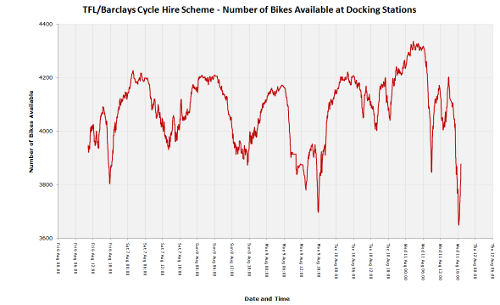
I’ve had my Garmin Forerunner 305 sports GPS for nearly three years now and it’s logged several thousand km of running and cycling. Up until recently it worked pretty flawlessly, but during my recent training tour to Sweden, during a particularly wet and physical run, I noticed it kept switching off. Further investigation revealed that, on tapping the unit, it would switch off. Jumping down various ledges in the tough Swedish terrain was presumably having the same effect. For subsequent runs, it refused to switch on at all, even when doing a soft reset (holding down Mode+Reset and then powering up) or a hard reset (holding down Mode+Enter while switching on).

While being plugged into the charger, the unit would operate fine – although when charging, the “Charging in Progress” would always switch to “Charging Complete” after around five seconds, and on unplugging the charger, the unit would switch off immediately, indicating the battery was completely uncharged.

Scanning various web forums talking about such issues, the soft or hard resets, or a firmware software downgrade/upgrade, were the standard fixes – having tried all of these, it looked like my only solution would be sending the unit back to Garmin for an out-of-warrenty replacement. Apparently, some forums said, they are willing to do this for free, with a quick turnaround, due to a “known manufacturing fault”.

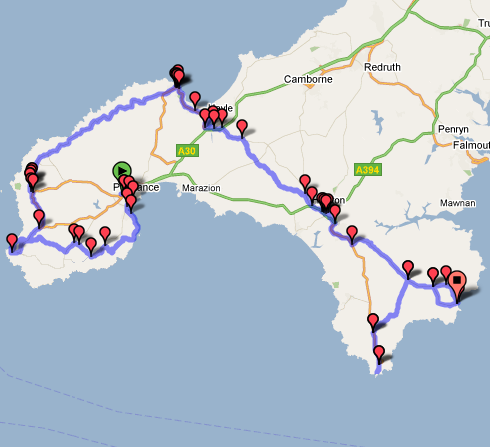
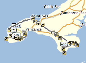
I need my Garmin fixed for Thursday, when it has to navigate me 1000km from Land’s End back to London, so that return-to-manufacturer wasn’t an option. Thankfully, I was able to solve the problem with a little prodding around inside the case.

The Forerunner 305 case is pretty easy to open up, as there are no screws for clips holding the front and the back together – just some weak glue. Prising the two parts apart with a small kitchen knife was straightfoward to do, and on examining the interior, the problem was obvious.

There are eight brass pins on the inside back part of the unit, on the other side of the case from the four charging/communicating contacts that connect to the docking station. The pins are bent back on themselves to provide a hinge to the corresponding eights contacts on the inside front part. The left-most metal pin was completely corroded and had gone green, presumably due to an electrolysis reaction with some water or sweat that had got in the case. Not all of the eight pins are connected to the four charging contacts – the affected one wasn’t, which was why communication with the docking station was working fine. However, this was presumably one that was connected to the battery, which was why the battery was unable to charge.

On touching the corroded pin, the raised section immediately came apart (not good.) After cleaning the gunk away with a pencil eraser, I used the kitchen knife to gently prize the remaining slab under the pin upwards, and bent it back on itself, so that it formed a new, shorter pin. I then put the case back together, joining the two halves with sellotape (for now – I need some silicon glue to make a good fit) and the unit now started charging normally, and appears to work fine.

Categories
OpenStreetMap Orienteering

OOM used for HH Street-O Event

Simon has a good article about how OpenOrienteeringMap was used for a street orienteering event in St Albans. See it here.