Categories
Olympic Park

Olympic Park T Minus 5

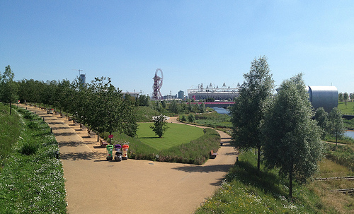
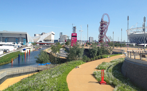
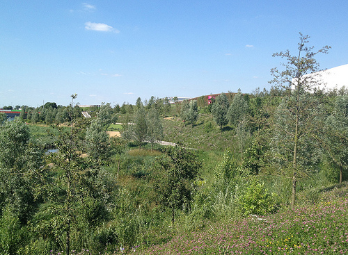
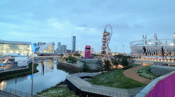
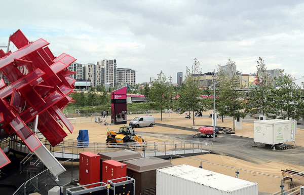
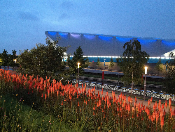
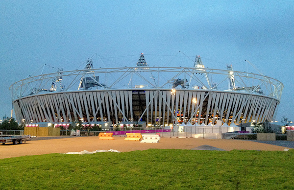
Here are some photos from the Olympic Park, on a sunny Sunday with just five days to go until the opening ceremony. If the sun stays around, it will be a lovely park to wander around in.

The park is looking lovely:

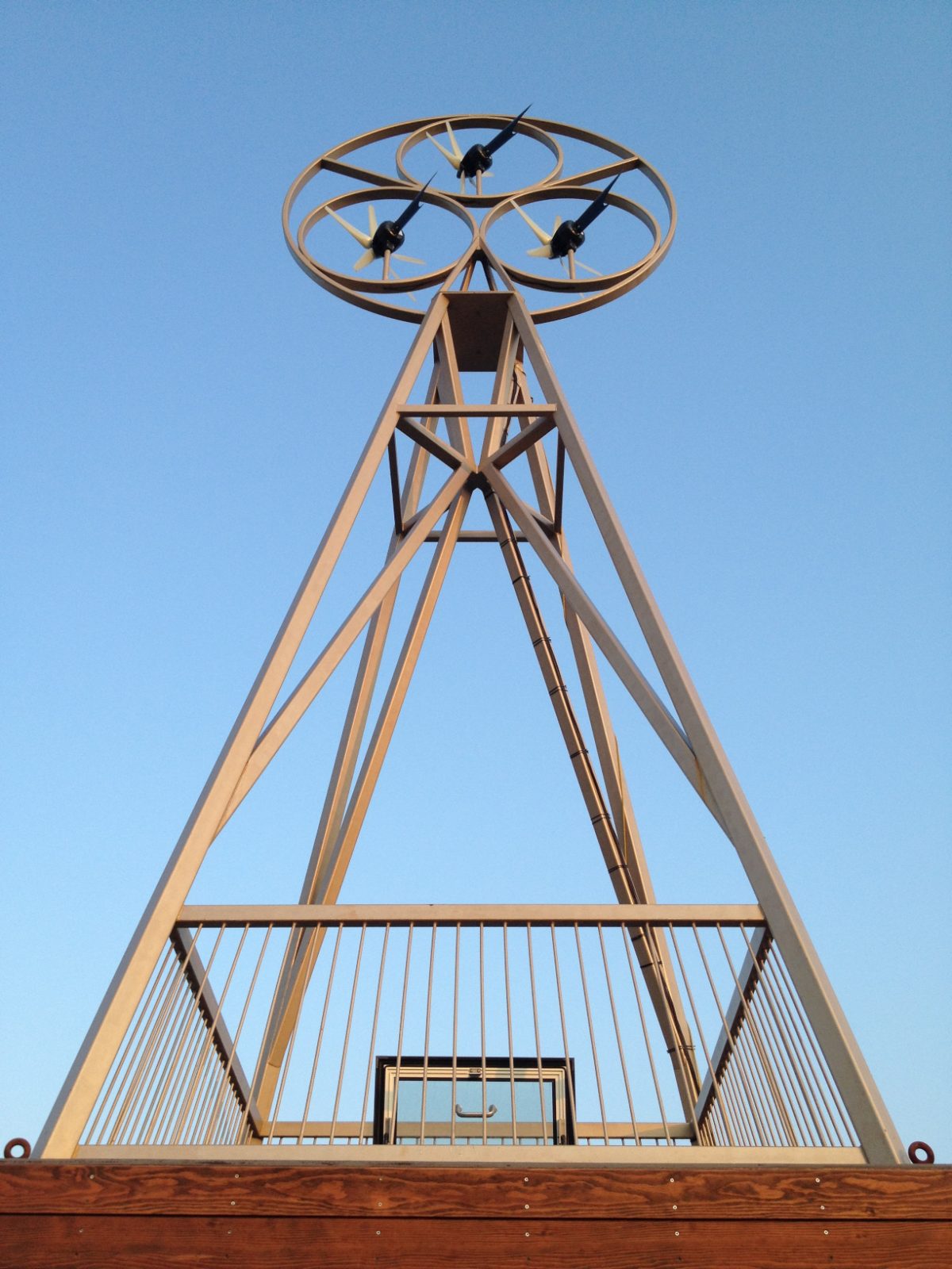
Some mysterious art here:

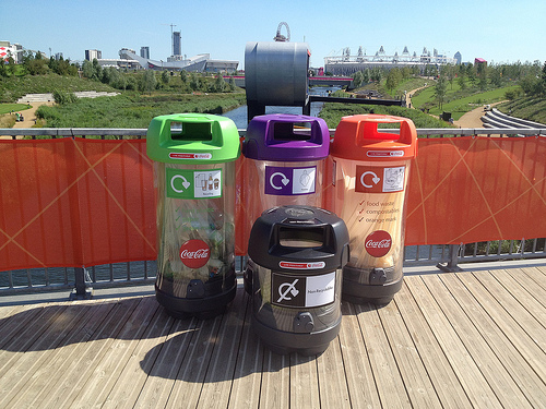
Each set of recycling bins, throughout the park, include a dedicated poncho bin – hopefully these will not need to be used:

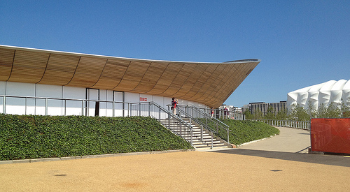
The Velodrome is looking as graceful as ever. White boards cover the windows, no peeking in!

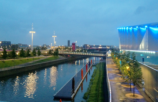
Parts of the Olympic Park are very green indeed:

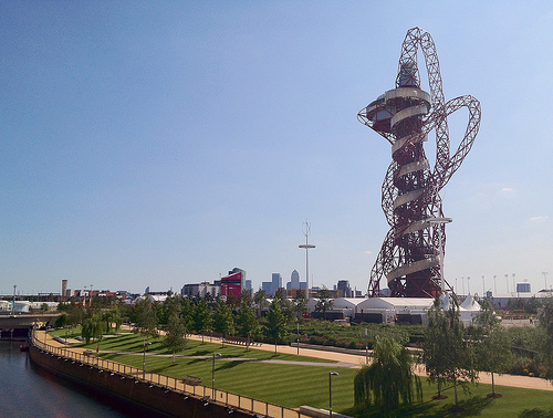
Further down, the Orbit is accompanied by its own garden:

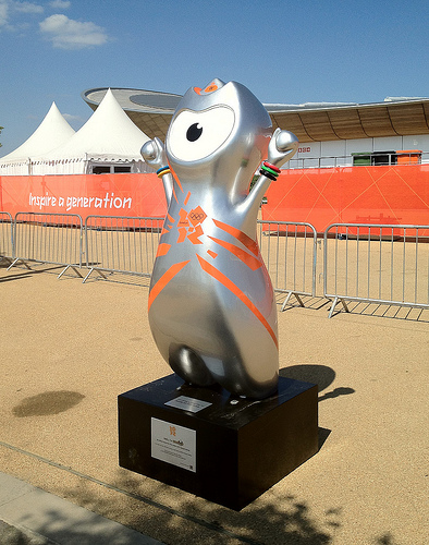
Wenlock might be around for longer than I thought:

Here’s the full album.

Categories
Data Graphics

Six Degrees of Twitter

This is my Twitter social graph. Click on the graphic to see a larger version.

Key

The font sizes for the names correspond to the number of followers, while the colour ramp (light grey to yellow to blue) is proportional to the number of listings per follower. That is, someone who has a small number of followers, but has been listed by many of those people (and others) will appear bright blue. This is designed to be a very simple measure of value and influence – you can have a few number of followers, but if many of those have considered you to be an authority in a subject (and are themselves switched on enough to know about Twitter listing) then you can be considered to be a more influential Twitterer. I bet you most of the “celebrity” accounts will therefore score poorly here, while experts will be picked out. Bad luck BTTowerLondon.

How this Compares to other Social Graphs

To make the graph, I have taken the subset of people that both follow me and I follow back. I’ve then looked at connections between these people. Doing this in Twitter is a similar idea to what has been done in Facebook and Linked-In before except that:

  • The groups that appear will be quite different to what appear in Facebook. Facebook is a social network for friends, whereas Twitter is more of a social network for interests.
  • Twitter’s connections are asymmetric (you can follow people who won’t follow you back, and vice versa) which means you have to think about exactly what you are mapping.
  • It’s much more of a fiddle in Twitter because you have to query each person’s connections separately.
  • Twitter’s rate limits (for unauthenticated connections) are aggressive – a maximum of 150 requests an hour from a single IP. Luckily I have access to nine Linux machines which run my Python scripts nicely.
  • The lack of the equivalent of Facebook “apps” that do this kind of visualisation automatically, mean you have to do it yourself. I produced the visualisation in Gephi, which is powerful but tricky to get to grips with.

There is one great thing though:

  • You can build up these kinds of visualisations for anyone, not just yourself, as the raw information is accessible to anyone.

Community Classification

My Twitter network is more homogenous than I thought – a big blog of tech/geo, with the orienteers forming the main breakaway group, and some slender strands of friends on either side. Networks of friends which don’t share any connections with the other groups, will not be connected at all and will float away.

Below is a hand-done, rough community classification. Again, please click for a larger, more readable version. If I pulled in more of the metadata (profile and qualitative/quantitative) from Twitter for each person, then this could probably be done automatically – enough people in the CASA cluster, for instance, will mention CASA on their profiles, for it to be detectable, showing such people as CASA-linked even if they don’t say so themselves.

  • A – The Neogeo (Geography+Technology) community
  • B – OpenStreetMappers in London and elsewhere
  • C – The Open Data movement
  • D – Data visualisation and data journalism
  • E – UCL CASA, UCL Geography and associates
  • F – London general
  • G – East London
  • H – Running
  • I – Orienteering
  • J – Non-techy friends
  • K – Techy friends
  • L – An unlinked group of non-techy friends There are a couple of other such groups.
  • M – People unconnected to themselves and the others
  • N – Bike share operators

The last group is small – I follow a lot more of them, but generally these “official” accounts don’t follow back.

Categories
Olympic Park

Olympic Park coming Together

Final preparations are being made in the Olympic Park – barriers and diggers are moving away:

…the flowers are coming to full bloom (no doubt helped by the excessive rain over the last few days):

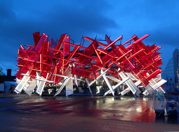
…the temporary sponsor pavilions, entrance gates, signposts and watchtowers are springing up (this is the fantastic looking Coca-Cola Pavilion by Pernella and Asif, alumni of the Bartlett at UCL):

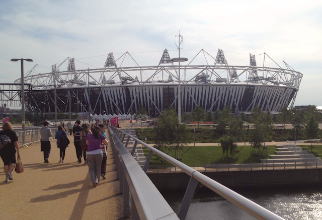
…and the plastic wrap around the stadium is finally appearing:

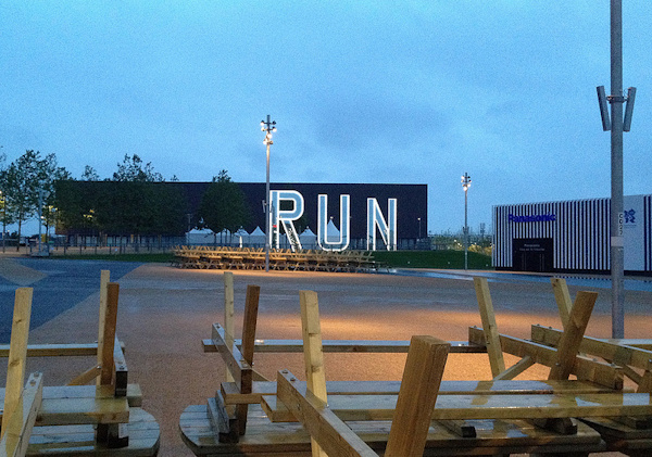
…along with some bespoke art (this is RUN by Monica Bonvicini):

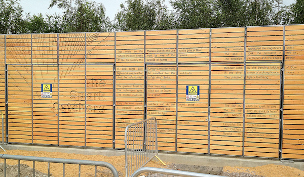
…in some unusual places (some work by Lemn Sissay on a transformer unit):

It’s all coming together!

Latest album, & all my Olympic Park photos so far.

Categories
Bike Share Conferences

Velo-City Preview

[Updated] I’ll be presenting at Velo-City in Vancouver later this week. Velo-City is the “world’s premier cycling planning conference”. It is likely to have a significant bike-sharing flavour – the lead sponsor being PBSC which designed the 6000-odd “Boris Bikes” (aka Barclays Cycle Hire bikes) that are a distinctive sight in central London, as well as equivalent systems in Montreal, Washington DC, Minneapolis, Boston and (shortly) New York City – known generically as Bixi bikes. Vancouver does not have a bike-sharing system of its own, but PBSC have imported a whole load of their Montreal bikes for delegates to borrow for the week, although a recent collar-bone break means I unfortunately won’t be taking up the offer. I did however spot a PBSC/Bixi bike “in the wild” in Vancouver’s beautiful Stanley Park – see above.

I’ll be talking about some new insights into bike-sharing cities worldwide that have been revealed by my Bike Share Map, as part of a three-part presentation on looking at bike-sharing cities at different scales – my co-presenters being the author of the Bike Sharing World Map, and the software developer behind the B-Cycle bike sharing systems.

My presentation is on Wednesday morning (Pacific time) and I’ll write/tweet about it on the day, wifi-access permitting.

To prepare for the presentation, I’ve added a few new cities to the Bike Share Map: Suzhou, Zhongshan, Wujiang, Shaoxing and Heihe in China; and Kanazawa in Japan. One early insight coming from these new maps could be that the Chinese really do work hard (if you excuse the gross overgeneralisation) – typically 11 hours between morning and evening commuter peaks, and seven days a week!

Hehei is shown below – it’s right on the Russian border, opposite a much larger Russian city – hence the Cyrillic (although no bridges across the river near there!)

Note that, in the maps of the Chinese systems, the docking station locations are slightly misaligned with the background maps because of location obfuscation carried out by that country – I’m using OpenLayers rather than the Chinese-based map service that corrects for the errors. The resulting offset is typically only 1-400m though so you can still get a good idea of the shape and size of each system.

Categories
Olympic Park

Inside the Olympic Park

Here’s some new photos from the Olympic Park in east London.

The main changes recently are:

  • It’s the first time the Park feels like a park and not a building site!
  • A more obvious entrance to the park is being created – Stratford Gate – consisting of a pair of large triangular gantries that people will pass underneath. It hasn’t been “dressed” yet.
  • The plastic “wrap” has started to appear around the outside of the Olympic Stadium. Each strip turns inwards near the base and becomes coloured, with seating block numbers appearing on the coloured portion.
  • The giant wooden McDonalds building is nearing completion.
  • Installation of the RUN sculpture outside the Copper Box look about complete.
  • Sponsor pavilions are appearing – Panasonic’s is near the McDonalds and looks quite attractive, although it feels rather out of place in a sporting complex.
  • Cisco has a very large, obvious and ugly brightly coloured pavilion mounted on top of the Westfield Stratford City complex, facing directly out to the park and the Aquatic Centre in particular.

Categories
Olympic Park

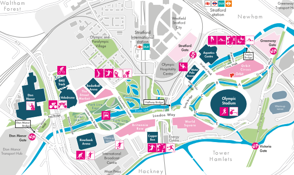
New Olympic Park Map

Here’s an updated Olympic Park Map, an extract of which is above. This one is notable as it includes names for many of the bridges in the park.

From north to south:

Eton Manor Bridge
Red Bridge
Waterfall Bridge
London Way Bridge
Channelsea Crossing
Halfway Bridge
Spotty Bridge
Water Polo Bridge
Stratford Walk
Aquatics Bridge
Purple Bridge

There’s also bridges A, B, C, D and E surrounding the Olympic Stadium.
Plus several unnamed bridges in the back-of-house part of the park.

Categories
Notes

Inactivity

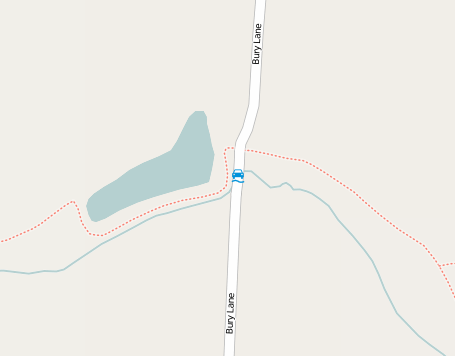
So… I fractured my collarbone when I fell off my bike last weekend, cycling too fast through a deeper than expected ford, while on a long cycle through country lanes in Essex. It’s a very minor break, not “clean-through”, but last week was a whole world of pain, and it will still be a few weeks before I’ll be back on my bike and/or running around again.

That’s not to say there won’t be interesting things posted to this blog imminently, though. Later this week I should have a chance to get right inside the Olympic Park. I am hoping to take some photographs of the park, as the finishing touches are made to the landscaping and the buildings.

Categories
Technical

CityDashboard – the API

Here is the API documentation for CityDashboard. It’s really not a very advanced API, and it’s not delivered in a “proper” format (e.g. XML or JSON), instead it’s available as a number of CSV/TXT-formatted files. It ain’t pretty but it works!

I’ve put together this documentation as a number of people have asked. However, it should still be considered to be a “private” API, so could change or break at any time, for one of three likely reasons:

  • I make a change to the API structure. If it’s a big change, I will attempt to preserve the old structure, possibly by using an extra parameter (e.g. &v=2) to indicate the new one.
  • Our server goes down. Certainly not inconceivable!
  • One of the upstream data providers changes their feed format in such a way that it causes the CityDashboard data to freeze up. Again, quite likely, particularly as generally I don’t have a formal agreement with the upstream organisations.

1. Finding the cities available

The list of cities available can be found at:
http://citydashboard.org/cities.txt

Notes:

  • Comma-separated.
  • The city_id is the first field of each line.
  • Ignore lines starting with #.

2. Finding the modules available for a city

The list of modules available for london can be found at:
http://citydashboard.org/cities/[city_id].txt

Notes:

  • Comma-separated.
  • The module_id is the first field of each line.
  • Ignore lines starting with #.

3. Getting the data for each module

The data for each module can be found at:
http://citydashboard.org/modules/[module_id].php?city=[city_id]&format=[csv|html|blob]

Example:
http://citydashboard.org/modules/weather_cr.php?city=london&format=csv

Notes:

  • Comma-separated or HTML, depending on the format parameter you use.
  • Ignore lines starting with #.
  • The CSV format will be most useful, as the HTML and “blob” formats are specifically designed for the CityDashboard website. However, many of the modules don’t (yet) have a CSV format feed available – a blank page will instead be returned.
  • The first line in each CSV file contains a number in the second field. This is the number of seconds between each update. i.e if this is 5, then the file won’t update more than once every 5 seconds.
  • Modules which have a CSV feed for them, have an “m” included in the sixth field in the appropriate row in the london.txt file (typical values, d, db, dbm etc)

By the way, the module list will most likely be changing very soon to add a couple of important fields that I overlooked – first of all, the source URL will be in a field of its own, and secondly I will add in a proper attribution statement for each source.

Categories
Technical

The MySQL Groupwise Maximum Problem

There is a surprisingly difficult task to solve with MySQL queries, which I’ve been spending some time trying to do – the Groupwise Maximum problem.

This is the name for the type of query that I was trying, although in fact I am trying to find a set of minimum (rather than maximum) values.

The question: What is the time each day that we a see a minimum of available bikes for? (a research question – as finding this answer will tell us something about the commuting habits of the city.)

The source data table:

timestamp bikes_available
2012-05-29 17:12:00 4265
2012-05-29 17:14:00 4251
2012-05-29 17:16:00 4251
2012-05-29 17:18:00 4253
2012-05-29 17:20:00 4259
etc…

My initial thoughts were:

select date(timestamp), time(timestamp), min(bikes) from bike_agg_london group by date(timestamp)

date time bikes_available
2012-05-22 00:00:01 4662
2012-05-23 00:00:02 4600
2012-05-24 00:00:02 4594
2012-05-25 00:00:01 4805
2012-05-26 00:00:01 4144
2012-05-27 00:00:02 3710

This produces the minimum bikes number for each day, which is great, but the timestamp included is just the first one of each day (in fact it could be a randomly chosen timestamp from within the day, but MySQL’s internal logic happens to pick the first one out). This is because the time(timestamp) is not part of the “group by” (aggregate) clause, and all fields in a query must be included in the group by unless they are part of the aggregate. I don’t want to aggregate the time(timestamp) though – I want the value associated with the minimum bikes, rather than the maximum, minimum or average (etc) value.

Here’s 10 ways to solve the problem, although I tried a few and they didn’t work for me.

Here’s a technique that worked for me (the second solution)

Here’s the SQL that worked for me, quite quickly (~18 seconds for around 166000 rows representing 600 days):

select date(b1.timestamp) theday1, b1.timestamp, b1.bikes from bike_agg_london b1 inner join (select date(timestamp) as theday2, min(bikes) as min_bikes from bike_agg_london group by date(timestamp)) b2 on (date(b1.timestamp) = b2.theday2 and b1.bikes = b2.min_bikes)

date time bikes_available
2012-05-22 2012-05-22 18:22:01 4662
2012-05-23 2012-05-23 18:12:02 4600
2012-05-23 2012-05-23 18:16:01 4600
2012-05-24 2012-05-24 18:18:01 4594
2012-05-24 2012-05-24 18:20:02 4594
2012-05-25 2012-05-25 17:54:02 4805
2012-05-26 2012-05-26 15:56:01 4144
2012-05-27 2012-05-27 17:24:01 3710

It’s the second solution from the above link. There is one problem, where if there are multiple rows in a day that share the same min(bikes) value, they each appear. Using distinct won’t get rid of these, because the time(timestamp) does vary. The fix is to use an additional wrapper (tables co3) to eliminate these duplicate rows:

select theday1, time(min(timestamp)), bikes from
(select date(b1.timestamp) theday1, b1.timestamp, b1.bikes from bike_agg_london b1 inner join (select date(timestamp) as theday2, min(bikes) as min_bikes from bike_agg_london group by date(timestamp)) b2 on (date(b1.timestamp) = b2.theday2 and b1.bikes = b2.min_bikes)) b3 group by theday1, bikes

date time bikes_available
2012-05-22 18:22:01 4662
2012-05-23 18:12:02 4600
2012-05-24 18:18:01 4594
2012-05-25 17:54:02 4805
2012-05-26 15:56:01 4144
2012-05-27 17:24:01 3710
Categories
Orienteering Events Log

A Room for London

I was lucky enough to get invited for dinner last night at A Room for London which is a boat/artwork perched on the top of the Queen Elizabeth Hall on South Bank (beside Waterloo Bridge), to discuss CityDashboard in the context of a future project, Big Data in the Londonscape. Thank you very much to the artists for inviting me a long for a nice dinner and discussion in unusual and scenic surroundings!

My photos from the evening are on Flickr.