Categories
Training

Repetitive Running

Here is my GPS tracklog for the middle Sunday afternoon session of the Nike Grid game, running between two phoneboxes in E2. In order to stave off boredom, I tried to vary the route every time. Each leg was 800m-1km long. The bottom left is the Mecca Bingo on Hackney Road and the top right is by the bridge across the Regent’s Canal, just south of Broadway Market.

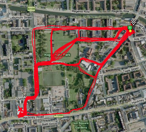
You can spot where a mini-football game was playing by my different routes through an otherwise unobstructed field. I also witnessed the aftermath of both a cycle accident (top right) and a car accident (top left)… The screenshot is from the Ascent application and includes imagery from Microsoft Virtual Earth.

I did so much running on the Sunday that I gave myself shin splints and so am not going to be doing any running at all for the next few weeks.

🙁

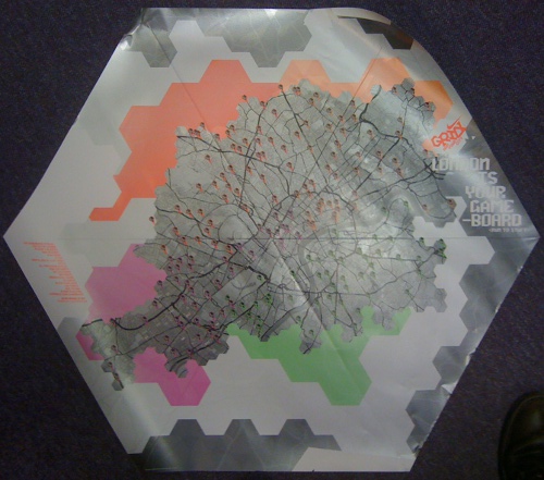
Despite my lack of personal success, my team did rather well and we have ended up with a lot of prizes.

Categories
Data Graphics Mashups

Boris Bikes – The Flows Are Coming

Adrian Short (@adrianshort) sent an FOI request for flow data for the first million journeys on the Barclays Cycle Hire bike shares in London (the “Boris Bikes”). TfL responded with a test dataset of the first 99 journeys -from roughly 6-7am on 30 July – and a promise that the data for the next 999,901 are coming!

I’m working on an adaptation of my bike share visualisation to show these flows. It’s not possible to show a million lines on the screen at the same time, so consolidation, selection and filtering will be applied, but it certainly is possible to show the first 100 – click on the graphic for a full-size image:

I’m using colour to indicate the direction of travel (see the wheel.) I’ve also shown the flows to a couple of specific docks:


I’ll build out the visualisation with the full data set and release it soon.

As start and end timings are included in the data, I’m sure it is only a matter of time before someone builds a version with little animated bikes moving from the stations into the city during the rush-hour, similar to Matthew Somerville’s excellent real-time tube visualisation, for which the underlying data unfortunately got pulled.

Categories
London Technical

Hodder Geography Nest

During November, I am the guest blogger for the Hodder Geography Nest, along with James, a Ph.D at UCL Geography. We will be blogging about the research we are doing, focusing particularly on maps.

Categories
Data Graphics OpenStreetMap

Nike Grid – Visualising Runners on the Streets of London

My last eight posts have all been on bike share, time for a slight change of topic – running rather than cycling.

In the last few days, I’ve been taking part on the Nike Grid alternative reality game (a futuristic take on street-o). The concept is a great use of social media – with an active Facebook group, key updates pushed to participants phones and Facebook walls, and a Foursquare-esque concept of “checking in” to the phoneboxes which act as the run timers, starting and stopping clocks and noting locations. How do you “check in”? You make a (free) phone call.

There is a strong mapping element to the game – online maps show the locations of the key phoneboxes in each postcode, the maps appear in printed form and as artwork on the technical T-shirts included in player packs sent to key participants.

The maps are based on OpenStreetMap data, heavily stylised in black, grey and white with a “region”-specific pattern for the background and another pattern used for parks. The phoneboxes are “pin” style icons placed on top. The maps have been produced by Stamen Design in San Francisco. It’s not the first time they’ve done cool things with OSM data.

Stamen are also producing daily visualisations of the runs. The run lines have a hexagonal style to them, which goes along with the hexagonal tiling of the 48 postcodes being used in the game, although the start/end points are geographically accurate. A hexagonal cartogram is used on the main website to show the postcodes in pseudo-geographic space, in some of the visualisation the hexagons then “explode” and move to their correct place on the geographic map – a clever linking of cartograms and geographic maps.

Categories
Technical

Rennes, a Model City for Transport Data

Having had some issues with obtaining the bike share data for some cities, it was refreshing to receive an email from some developers in Rennes, NW France, detailing the public API for transport data that the city has made available, under a Creative Commons-style licence for reuse. You have to sign up for an API key, through their data website, and then all the data you need is available, quickly and with documentation, through XML or other popular machine-readable formats. As well as the bike-share data, metro line information, including alerts, is also available.

Why can’t all cities be like this?

Picture by Eun Byeol Lee on Flickr

Categories
Data Graphics Mashups Technical

Fewer Cities, More Cities

Some bad news and good news about the Bike Share visualisation.

The bad news – the operator behind the schemes in Paris, Seville, Vienna, Dublin, Brussels, Valencia and Toyama asked me to stop getting the current bike share data from their websites. Although I was just loading their webpages, “in practice you are extracting data from [the operator’s] databases and re-utilising it” and “[the] databases are protected under the harmonised sui generis database right, as provided under Directive 96/9/EC: chapter III article 7 (1) and (2).”

For these seven cities, you can still see a historical snapshot from last Monday, when the feeds were switched off, but not the live status, historical animation or trend graphs.

This is despite a quick search on the web revealing a six-month collection of data for one of the schemes (at four minute intervals), the resulting trends being shown at a conference; a better-service campaign website, again for one of the schemes, with regularly updated performance tables; and an iPhone app pulling in the data from numerous schemes run by the operator, amongst others.

Digital Urban also mentioned this in the context of Bike-o-Meter, which uses the aggregated data from my Bike Share maps.

Now for the good news – I’ve added in five more cities – Rennes, Bordeaux, Zaragoza, Mexico City and Rio de Janerio. Yay! The inclusion of Mexico City and Rio should hopefully counter some claims of an European/English-speaking bias! Mexico City’s scheme appears to be concentrated in one very affluent district of the metropolis, while Rio’s is based on the seafront south of the city, rather than in the main urban area.

Rennes is a particularly interesting example, more about that shortly.

[Update – turns out I’m not the first.]

Categories
Conferences Data Graphics

Visualising Bike Share

Here’s the presentation that I gave at the #geomob London Geo-mobile developers meetup at UCL last night.

[slideshare id=5528647&doc=visualisingbikeshare-101022061626-phpapp01 width=”590″ height=”480″]

Please note the data presented is preliminary and unreviewed and should therefore not be considered to be definitive or necessarily correct.

Categories
Data Graphics

Real Life Tweet-o-Meters

I was at the British Library yesterday for the launch of the Growing Knowledge exhibition of innovative research techniques. One installation has been built by Steve and Ben at CASA and is a real-life version of the Tweet-o-Meters (which were also the inspiration and technology for the Bike-o-Meters I mentioned yesterday.)

The installation has dials for nine cities around the world, showing the current level of Twitter activity (i.e. geo-located tweets) in these locations.

I love the “1930s retro” design of the installation. It is notable that all the other installations in the exhibition involve computer screens, in several cases these are used to display old maps (e.g. the New York Public Library rectification service) or historical paintings (using a Microsoft Surface screen.) I love the irony that the exhibition that is showing the data right now, i.e. coming live off Twitter from around the world, is the one which doesn’t involve any computer screens at all – although they are of course computer-controlled behind the scenes.

There’s something wonderfully organic about seeing the needles go ricochetting off the ends of the dials, as sudden bursts of tweets from a particular city come in. I hope the distinctly analogue technology survives. I think we get the work when the exhibition closes next summer. I’m pretty sure, when Steve’s not looking, it will be quite straightforward to “retro-fit” it for a physical monitor of bike share schemes. 😉

Steve has posted some more pictures from the exhibition, including some behind-the-scenes shots.

Categories
Data Graphics Mashups

Dials and Levers Overload

Steve, here in the lab at CASA, has adapted his popular Tweet-O-Meter display of Twitter activity in cities around the world, for my bike hire maps, to create Bike-O-Meter. Now, on a single screen, you can see lots of Google-powered gauges, showing how busy the bike share schemes around the world are right now. Some show massive spikes during their rush hours, while others are more popular at weekends. Most dials will move every two minutes, a few (the Velib ones) update every 10 or 20 minutes.

At the time of writing, the bike share schemes of the Spanish cities, particularly Barcelona, Girona and Valencia, are the ones being most actively used. Spanish rush-hours at lunchtimes seem generally to be as big as the morning/evening ones! Biking home for the siesta?

There’s a second mode, accessed here, that shows how unbalanced the schemes are – high values indicate that a lot of the bikes are concentrated in one part of the city, and there’s a lot of empty docking stations in another part. The metric is the percentage of bikes that would need to be moved to balance out the docking stations across the city.

Thanks Steve for making this awesome visualisation!

Categories
Leisure OpenStreetMap

Nike Grid is Back

Nike’s alternative reality game/metrogaine/street-o – Nike Grid – is coming back to the streets of London. This time it’s over two weeks rather than just a weekend, and involves an element of teamplay – you can join a team based on your London quadrant (N, E, S or W) or university, or an adhoc one.

Of note, the map in the player pack is a rather nice (I think) restyled silver-and-black version of the green-and-black fold-out maps used in the original game. The source data is OpenStreetMap and the cartography reminds me somewhat of 8-Bit City – it’s not particularly useful for precision navigation, but is a nice example of Boing-Boing cartography, to borrow an expression from a talk at the recent Society of Cartographers conference. Oh, and they have credited OpenStreetMap contributors this time – yay!