The Warwick Town Race was the final urban orienteering race in this year’s Nopesport Urban League, so I thought I would recap the six urban races I enjoyed the most this year – most of them Urban League but with some non-league ones too:
Best 6:
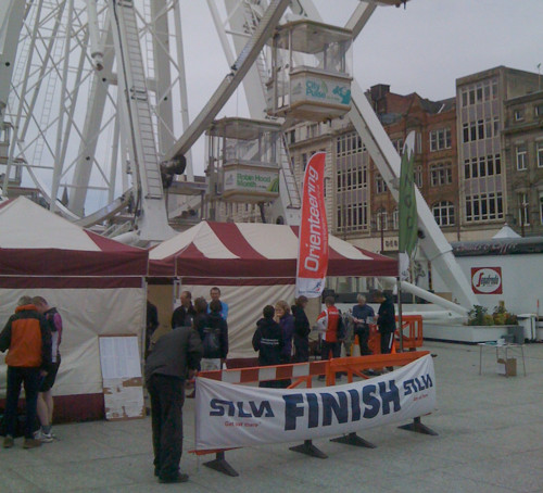
6. Nottingham
I had been meaning to visit Nottingham for ages, and enjoyed this great city centre race, which included the ceremonial Park Estate, an interesting leg up and through the castle complex, and a start/finish in the city’s central square, right underneath a big wheel!
5. Carlisle
A bit of a trek to get to this one, but it was worth the effort, as excellent course planning took us on the sights and included some classic route choice legs, a shopping-centre control near the end, a maze control, and, like Nottingham, a start and finish right in the main town square – excellent for promoting the sport!
4. Lincoln
My third outing here for an urban race, and finally the event is getting the numbers and recognition it deserves. We didn’t get to go in the castle this time, or the city walls or university campus, but instead, like Carlisle, we got a maze control, and a good mix between modern urban areas and the historic centre. Lincoln is one of my favourite orienteering cities and on my must-do list.
3. Didcot
An unexpected delight – the make was entirely in a Milton Keynes-esque housing estate with wiggly roads and unanticipated barriers. Some excellent planning kept the technicality going all the way around. I fell into numerous route traps.
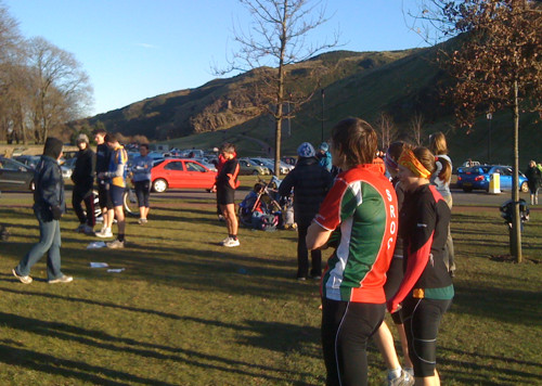
2. Edinburgh
This race is always very early in the year, so is chilly, but the weather was once again sunny. This year’s courses didn’t focus so heavily on the intricate Royal Mile, housing estate and university areas, but the less technical focus was more than made up by the spectacular views on Calton Hill, a section through Princes Street gardens, and some spectacular leg choices including a possible route right through the city station.
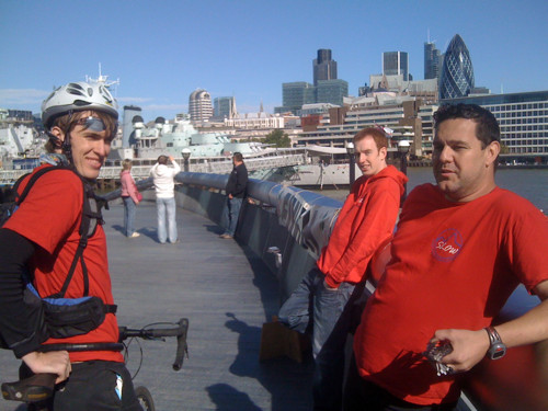
1. City of London
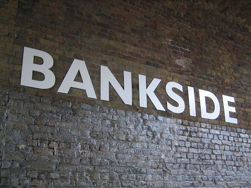
A bit cheeky perhaps to put the race I founded and my club organises at No. 1, but this year’s was even better than the first two years. We had a huge turnout – over 700 running on the day – and the race also got the club together spectacularly, running the show smoothly on the day. With Alan as Race Director and Matthais Mahr (of Venice Street Race fame) as the Course Designer this year, the courses and situations were both superb – the weather being perfect, for the third time in a row, also helped. The second half of the courses were in Bankside and Bermondsey, which meant crowds of passers-by were encountered by the competitors – not something experienced in the City proper at the weekend. Next year’s race is already in the planning and will hopefully be even bigger and better.
Cities that I most want to run an urban race in:
- Bristol
- Bath
- St Albans (happening in 2011!)


