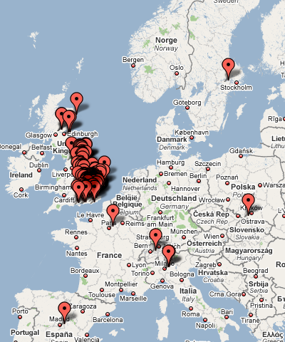
I’ve been using Google Docs and Spreadsheets to manage the planning for the City Race. There are some very “cool” features in Google Docs – one is the visualisation widgets for spreadsheets. They are extremely easy to use – just click and place them in, and they visualise your data, updating dynamically.
Here’s a quick visualisation of the locations of everyone who’s entered the City Race so far. This took me about two minutes to do – one minute to concatenate the appropriate address columns in the entries CSV file, and one minute to paste it into a Google spreadsheet, add the widget and watch it geo-visualise. The geo-coding from addresses to locations is all done on the fly.
Europe:
England:
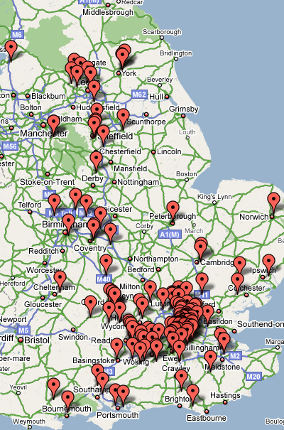
(Images from Google Maps – Map data © Tele Atlas)
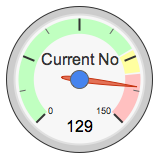
p.s. Here’s another Google visualisation widget, for the number of Men’s Open class entrants. That course is rather full now…